Loud music fuels painter's abstract art
By Jennifer Hogan
(The Citizen, Saturday, December 12, 2009)
The process of creating an abstract painting involves not only a paint brush and paints but an emotion that comes from within the artist.
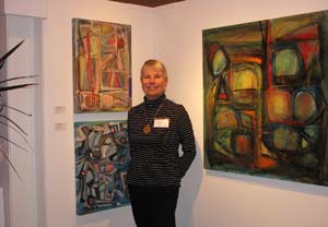
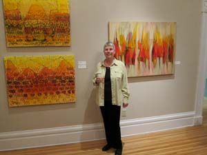
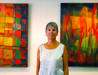
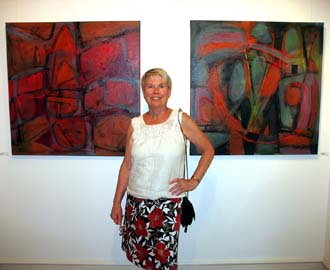
Since Nov. 13 the abstract paintings of Ithaca artist Lynne Taetzsch have adorned the second floor of the Cayuga Museum in Auburn, and on Saturday afternoon, Taetzsch talked with art lovers and patrons of the museum about the process that she, as a lifelong artist, goes through to create her works.
Taetzsch said that her creative abilities began first as a childhood fascination with play dough and doodling that grew into several other mediums through the years. But when she found a passion for abstract painting, the era that she lived in did not hold women artists in high esteem. “As a girl in the 1950s I resented the limited role assigned to women,” she wrote in her artists statement for the exhibit. “I used strong colours and forceful gestures in my painting avoiding any effect that might be deemed feminine.”
Taetzsch said that she has grown more into herself and her role as a woman artist since that time. “A painting essentially takes your entire life,” she said. “You grow and learn and you can see that in your work.”
A lover of vibrant colors and bold lines, Taetzsch said that her favorite shapes are the circle and X, both apparent in many of her paintings. “The paintings will tell me what it needs,” she shared with guests.
Influences in her paintings are derived from nature and music and Taetzsch said that she will often form a brush stoke in tune with the music. “Nature is an abstract painting,” she said, “and I listen to loud music while I paint so my brush strokes will be big and go along with the music.”
Taetzsch said that viewers all take away something unique from her work. “Everyone has their own thoughts and visions,” she said. “No one will ever see one of my paintings the way that I do. But that is OK. That is what abstract is all about. For me the joy is in the process.”
A Soothing Place to Work
ARTBYLT.COM Contributes to CPG's Office Renovation
(Reprinted from WWW.DESIGNJOURNALMAG.COM, Fall 2007 p. 75)
When Matt Dennis, Senior Managing Director of Clear
Perspective Group, LLC, was looking for art to complete
the renovation of their offices in Medina, Ohio, he came
across Lynne Taetzsch’s website, ARTBYLT.COM. One painting in
particular struck him: “What attracted me to Planet Perspectives,”
he says, “is the vague background, yet a somewhat crisp and more
‘orderly’ foreground. It makes me feel like things are ‘coming into
focus,’ which is what we do.”
Clear Perspective Group (CPG) is a young investor relations
consulting firm that works with clients to help them increase their
corporate transparency. It was important for CPG that its offices
provide a stimulating, yet soothing atmosphere for the professionals
who meet and work there.
Matt Dennis’ requirements for the art he chose were: a) it had
to fit into the contemporary décor of the offices, and b) that it
reflect the mission of Clear Perspective. He found both in the
contemporary abstract paintings of Lynne Taetzsch.
The first, Planet Perspectives, a 44” x 44” original acrylic
painting on canvas, fit perfectly into the conference room. The
space, which features a large boat-shaped conference table
and chairs, and a credenza with visual board, has Toffee Shaw
Curtain Call carpeting, beige walls, and a dark brown accent
wall (Fallen Timber).
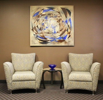
Matt needed a second painting for the conference room, and
asked Lynne to paint a commission for CPG. The themes or
ideas he wanted the art to reflect included “seeing what others
cannot see,” “enhancing transparency,” and “making something
confusing understandable.” These are the same themes inherent
in the company name, “Clear Perspective.”
Matt sent swatches of paint color and fabric for Lynne to work
with, which included the basic beige paint used throughout the
offices. Matt also mentioned that picking up the Cobalt Blue and “starburst” from their company logo would be great, as well.
But what really attracted Matt to Lynne’s art in the first
place was its energy and playfulness, so he added: “Now take
everything I’ve said and forget about it . . . turn on some music
and have fun!”
Whenever Lynne paints a commission, she likes to make two canvases and give her clients a choice. When she sent the images to Matt, his response was, “Love them both. Superb job!”
Matt ended up selecting Open Focus, a 48” x 44” acrylic painting on canvas, as shown here in its setting in the reception area. Both the title and the composition of the painting reflect the themes important to Clear Perspective Group. Plus, the Burnt Umber and Cobalt Blue used in Open Focus pick up the accent colors in the room. A Nightfall Cocoa laminate finish graces the reception desk, and four club chairs, two Danko/Persing spider tables, and one Art Design International high-back desk chair complete the area.
Both canvases are gallery wrapped — stretched around and stapled to the back of the stretcher frame so that no other framing is necessary. When viewed from the side, this gives them a three-dimensional look.
Lynne’s highly acclaimed original paintings and limited edition giclee prints on canvas are hanging in private homes and corporate offices throughout the world. More of her work may be viewed at WWW.ARTBYLT.COM.
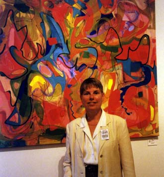
Color Contrast
by Stan Bowman
(Reprinted from the Ithaca Times, December 12, 2001, p. 14)
Red is the color of fire, hot, moving, sometimes dangerous. It is also the color of blood, that vital substance necessary for all human life. Red is demanding, attracting, arresting. Red is also associated with many different objects in our culture from fire hydrants to stop signs, all meant to get and hold our attention.
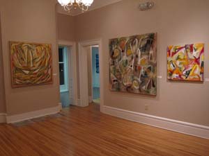
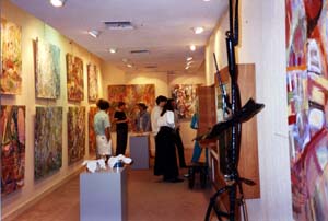
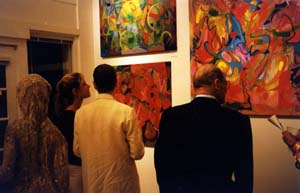
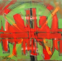 What I find intriguing in the acrylic paintings of Lynne Taetzsch, currently at the Artspace at the Clinton House Gallery, is that every work on display has some red in it. Some paintings are even dominated by this color, calling us to stop and look at them. It is as if energy is emanating from the works, bouncing off the walls in this room of modest size that can accommodate perhaps only 10 to 20 works. Standing in the middle I could feel an energy to this space created by the art, and myself attracted to examine each work carefully to find the sources of this power.
But the color red is only one part of the story. Taetzsch is a painter very much in the tradition of the best of 20th century abstraction. She understands how to organize a canvas, how to arrange elements with extraordinary control over their placement. One of the most interesting aspects of this show is that I found both works that have a clear visible sense of structure around some particular object while others have a looser balance of shapes and brush strokes. Both approaches work equally well.
"Red City" has a sharp-edged horizontal band of red color in the middle, bursting upwards and downward creating what can be seen as profiles of a city skyline, one right side up and the other upside down. In the background both above and below is what one might identify as a green sky. The red against the green creates a vibration of energy that grabs and holds our interest. "Seeds of Inquiry" is another painting with more clearly defined hard-edged shapes. Two circles of different size in the center of the canvas almost suggest a bullseye target, and play against outer squares of greens and browns. Layered on the circles are sweeping wave like shapes of red that move from the four outside edges toward the center, almost meeting, setting up a tension because they do not meet. A narrow horizontal strip of red almost bisects the painting and stabilizes it by suggesting a ground horizon line.
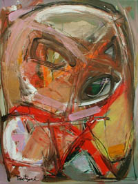 On the other hand, "Wizened" is one of those paintings that works with a looser sense of organization, with patches of overlaying colors and brushstrokes. The top two thirds has wide bands of browns and whites that almost make a circle, but the edges are soft and spread out almost disappearing into other soft strokes of similar colors. A soft-edged "X" of red is in the lower part of the painting but also melts into surrounding colors. What gives this piece its force is the sure sense of structure and movement. There is a rich exciting mix and intermingling of colors, yet there remains clarity of arrangement. Two large "X's" dominate the painting "Hidden Grace." In the background are highly gestural strokes and shapes of blues, pinks, whites, and dark reds. Perhaps more than most this is a painting about gesture and movement. It is also about layers wherein darker patches of color are overlaid with increasingly brighter and more vigorous patches of reds and whites. Moreover, there is a balance to the whole, creating a sense of a careful organizational plan.
Taetzsch has spoken about her work almost like a piece of music, as if she were constructing an orchestral movement. She says, "I struggle with the canvas, building it up and breaking it down. Space is there to be enclosed and disclosed; defined and defiled by line; shaped and misshaped by form; made subtle, empty or blatant through color. Form. Line. Color. Some days we dance together, some days we engage in a bloody fistfight."
What is of great interest to me is that, as a viewer, I do not really see this struggle she speaks of so eloquently. I see an artist who has a very masterful control over her works, creating a coherent and forceful expression on canvas. But then perhaps this is the role of the artist, to create order and expression out of a chaotic mixture of color and shape. This is surely the role of the abstract painter, and a role that Taetzsch takes on and handles superbly.
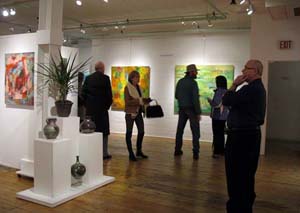
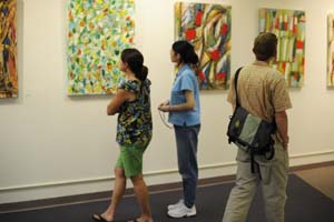
This exhibition of paintings by Lynne Taetzsch will be on display at the Artspace through the end of December. If you are interested in good abstract painting, or just interested in good art, this is a show well worth a visit.
Taetzsch's Paintings Erupt With Riot of Color and Motion
by Rebecca Stephens
(Reprinted from the Florida Flambeau, November 2, 1990)
Beyond the maze of burlap partitions where state employees cautiously guard Florida's artistic and cultural treasures, a display of acrylic paintings by Lynne Taetzsch erupts with a riot of color and motion. Mood and connotations are optional and open to the individual viewer; intense engagement, however, becomes a given.
Although bold and aggressive, the work is user friendly. You can find what you seek in each of the paintings. Faces, birds, flowers, elbows are suggested, begun for you to complete if you like.
"For Mercy" tells a maritime tale of a storm-tossed ship under merging channel markers that mock like Scyla and Charybdis: red light, still no return. But look to the right at "For Example" and the ship is gone. Look back and you realize it was never there at all, "nor was meant to be." The companion piece "For Example" subverts essence with shape, and shape with motion. What you saw in "For Mercy" was only a motion, and this time the motion makes a basket of 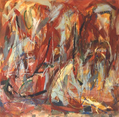 confetti on a gray day.
Even color refuses to stand still in the scorched-reds in "For Want Of" and the melancholy greens in "Yet Sometimes." These pieces seduce the eye with the apparent comfort of a clean, open surface, only to shock with a slash or a stroke that reminds us that red is not white and green is not blue. Blending can be an illusion, too.
"Yet Sometimes" and "In The Next" stand somewhat more still. The broader lines in "Yet Sometimes" and the clearer suggestion of floral shapes in "In The Next" offer resting places among a shouting discourse of color and motion. Yet each of these paintings speaks of what would be. The flowers in "In The Next" uncoil and do a linear dance, and the bright patchwork of "Yet Sometimes," confined by shadowy background shapes, seems at every glance to contemplate its escape.
Artist Evokes Colorful Mindscapes
by Patricia Foster
(Reprinted from the Florida Flambeau, July 6, 1990. p. 9)
Mondrian grew up with "the idea that art might be knowledge becoming conscious of itself." The words "becoming conscious" seem significant, implying that the artwork is in process, taking on a life not dictated by the artist but in collusion with him or her. Such an idea suggests that art is not the sum of its parts but a mysterious stew of conscious and unconscious ingredients. What meaning the artwork accrues may even be unknown to the artist, who, like a bug in a web, is still caught in that tangle of ambivalence which produced the work.
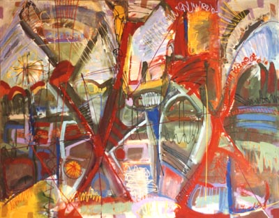 Such thoughts floated through my head as I viewed Lynne Taetzsch's abstract paintings now on exhibit at the President's Gallery at Florida State University. As I walked into the exhibit, I felt I'd entered an internal landscape, a portrait of moods ranging from the quietly restless to the achingly paranoid to the more playfully robust. All of the paintings show Taetzsch's involvement with play, chance and the labyrinth of primary colors becoming tropical in "In the Next," "For Want Of," "For Mercy," and "Slowing Down" as if the artist had spent her imaginative childhood in the hot glove of an island sun. Others reflect not this overt brightness, this primary splash of reds, oranges and yellows, but an interior darkness, a mind self-absorbed, not reflective, but rather obsessed with itself to the point of almost cannibalistic energy. "This Kind of Situation" is such a painting. The colors are muddied, the lines a short scaffolding of strokes. It suggests a dream gone bad, a nightmare shared not in narrative, but in color, an inkblot interpretation of the mind's chaotic wandering.
According to Taetzsch painting is a struggle to keep destroying the painting and re-making it. To avoid making something pretty.
"In plain terms," she said, "I try not to plan a painting before I start, to choose colors or lines I know will work, to settle too soon for something which looks good, to content myself with familiar patterns. I try instead to let the wild side free."
The most successful paintings are those which suggest this wild side, primal feelings often censored by the conscious mind as messy and suspect, crude and debilitating, but also ecstatic and freeing. "In The Next" and "For Want Of" were such paintings for me. "In The Next" reads like bold caligraphy of contemporary street life with its chaotic shifts of color, its central focus little more than a bisecting stroke of red. It reminded me of an emotional map of the city, its arteries marked in red and black, an occasional foliage burst of yellow and blue allowing the eye moments of rest and relief while the orange-reds--the blood-heat of the city--slashed through its center. "For Want Of" is also a "red-scape," but muted by dusky blue, lemon and cement grey in diagonal slashes. It too gives the sense of landscape, of pell-mell collisions, of the need and urgency with which we often live our lives. The title suggests a hungering, a need not yet satisfied, the blood aroused, but uncertain of its course.
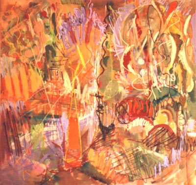 In contrast to the "red-scapes," several paintings lend themselves to a floral motif--an abstraction of vases and flowers, as if the artist had focused on a still life and then blurred the lens. "In Such Places" is a garden of color, everything in bloom under an intense light. Even the strokes rush upward as if seeking the sun. There's whimsy here, a playful energy that might suffocate by its profusion. It's companion painting, "Slowing Down" is again tropical with much the same colors,but this time softened by an arch in the left hemisphere and a group of willful black stems which spiral upward and then fold in bluebell-like buds. "Where Were You?" suggests the floral in close-up, the interior of petals and leaves opened and dripping with stamen, pistils, the hard knobs of buds blackened into seeds. Again the eye floats over the surface, not centered on one color or shape, but darting from vibrant lavender to pink to turquoise.
Taetzsch's exhibit is a catalogue of visual energy let loose on canvas. It is a searching, unfinished energy, willing itself to overwhelm. Though it follows in the abstract tradition of Pollock and de Kooning, it has a life of its own, a wildness, a perversion that seems to be questioning what it is.
"I don't want to complete an intellectual exercise," Taetzsch said. "I want to allow my hands to become the tools of my eyes in an automatic synthesis of reacting to the visual playground."
 Press Reviews of the Abstract Art of Lynne Taetzsch